If at any time watching Mad Men, you came across images like these or even if they managed to get flashed in front of your eyes, you must have (or at least should have) wondered how advertising evolved as the greatest ever marketing tool in the 20th Century.
Well, advertising was a dish with a complex recipe with ingredients like electronic media, bright colors, attractive models, colorful pictures and power of words (copywriting), and most of it still holds true.
All this combined accompanied with a latent demand produced a stimulant so compelling that made our grandparents and then parents and now us, to go and gratify our consumer senses by buying what these ads were and still are selling.
It is 2017 and the times are changing rapidly. Physical advertising like billboards, TV ads, print ads have started to fade and are swiftly replaced by digital marketing as every business is coming on board to a different platform- the internet. Everything and everyone is going “online” and with this paradigm shift, there is a drastic change in the way we are advertising.
One of the most effective advertising/promotion platforms in the present day is the website. The websites have evolved from a mere “who we are and what we do” to an advertising platform cum POS (point of sale).
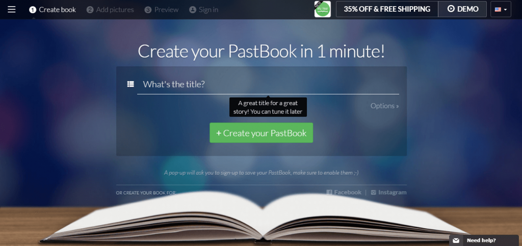
The fundamentals always remain fundamentals and just like the old complex recipe, the hunger still gets stimulated, but this time with new ingredients. One such ingredient is the [CTA] call to action button on your website. CTA evolved in a similar way that the websites did. From being a small boring button at the bottom of a website page (which helped people to submit their information) to an inciting ad (with bright color, great copywriting and smooth edges) compelling a customer to click it and get converted into a sale from a lead.
You can’t get a stimulating Call-To-Action without being different from others just like you can’t get an engaging content without presenting something distinct.
How to increase conversion rate – Here are 7 hacks that would help boost clicks and conversions through call-to-action:
1. It’s All About Words
In advertising, words are everything. And just like everything else, words also eventually fall in the cliche category, as once they are used by masses they become generic. Everything is changing, right from the website layout to the user experience, then why not the words. Choose to drop the cliched words like ‘submit’, ‘click here’, ‘download’ etc. These words have become so generic that the stimulation is to click is fading away.
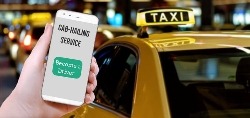
For example How to increase conversion rates – a cab-hailing service has put up a page for registering drivers with them. Instead of just having a CTA quoted with a simple ‘sign up’ they could use ‘Become a Driver’. ‘Become a Driver’ are any day more actionable words, despite the fact that the action would be the same (submitting personal details for getting registered). Such CTA buttons would eventually increase conversions on your website.
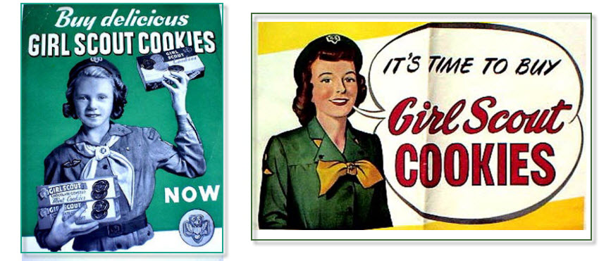
2. Action Pictures
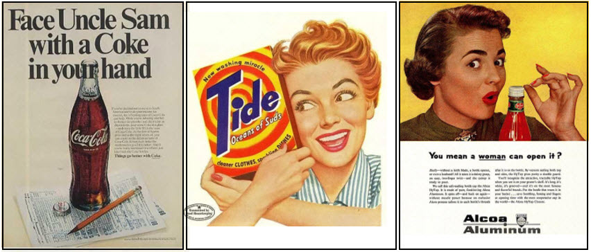
Go back to the top and see the 2 ladies; one with the Tide packet and the other one with a Heinz ketchup bottle. What do you find common in them?
Both their facial expressions say something (coincidently, in this case, they both are excited). Yes, this is another fundamental which didn’t change through the ages.

Science has proved that visuals are much stronger than text and advertising picked it as a great learning. Just like the 1960’s pop art commercials, adding an action picture (happy, excited, awed) near the CTA button, would stimulate the person to click it. These action pictures amazingly increase the clicks on your website.
3. Pointing and Arrows
Another question to think about- how even today do we spot the HTML link to click on a website page? You guessed it right- the finger pointer. Pointing as always been extensively used in human culture to give directions. As arrows and pointers are an extension to the visuals, they are again stronger than the text.
Using an arrow or pointing a doodled hand toward a Call-To-Action button could stimulate the user to click much more times than a plain CTA button would.
4. Look at the Grammar
At times for writing ad copies, it becomes more important to focus on the grammar than the vocabulary. Although copywriting is the art of using words, but a little tweak in the grammar could make a huge difference.
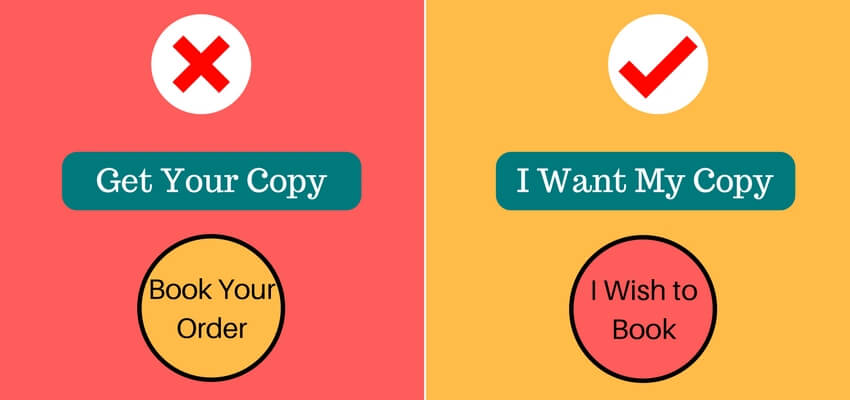
Most of the Call-To-Action buttons still use 2nd person lines like- ‘Get your copy’, ‘book your order’ etc. Changing the form from 2nd person to the 1st person on a CTA button could do wonders like- ‘I want my copy’, ‘I wish to book’, ‘place my order now’ etc. The first person quotes give users a sense of control and also a sense of possession that drives them to click.
5. Time-Bound Words
Procrastinating thing is a human tendency and we need either strong words or a loud sound that triggers us to take action and probably that is why we have alarms that go off with reminders and a talking A.I. nowadays.
But words are not new to stimulate action, especially with advertising. There have been some pet words like ‘now’ and ‘today’ which slowly caught up the trend due to their time-bound quality.
Using such words on a Call-To-Action button which give a sense of time-bound are very efficient as they create a sense of urgency and playing subtly by the underlying meaning- that you don’t want to miss this opportunity.
Examples
“Book my copy now”
“Order my piece today”
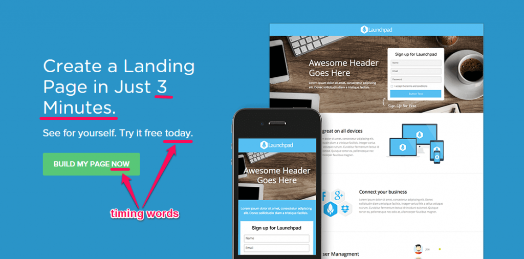
Image Credit: Neilpatel.com
6. The Following Step
Have you wondered what makes you hook to a TV show before you vanish from the front of the TV to finish that pending task in a commercial break or adding a movie to your list that is soon to be released?
The answer obviously is an enticing sneak peak or a trailer in the case of a movie. It has been decades now that marketers in electronic media use such tactics to create curiosity to hook the audience. On similar lines, a CTA could also be designed, which would not essentially create a curiosity that would hold you on but would make a user move further to the following step then and there.
Examples:
“Want a demo now”
“Get a free trial now”
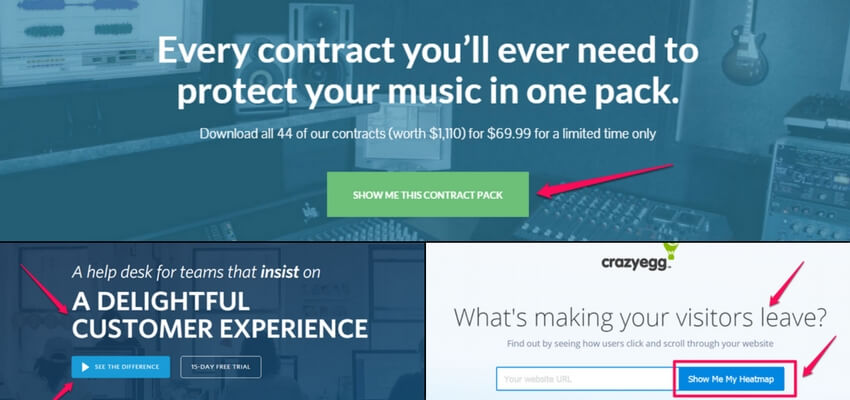
Image Credit: Neilpatel.com
7. Time Dimension
There was a time when people would buy a book on recommendations as buying a book involved substantial investment plus investing the valuable time was another dearer resource to part with.
And then libraries helped them out, making it possible to ‘pick and try’ any book and keep it down if it didn’t create much interest.
Something similar happened after the internet boom. Every content in the world is getting online and you do not have to invest huge amounts of money to buy them and then put your valuable time to go through it. Despite so much information at your disposal, there is a dearth of time.
Registering or signing up could be a tedious job and people might not just want to go through it unless there is strong urge to do it. In this era of shrinking time, you could let the user know exactly how much time it would need him or her to do the task by posting a line near the Call-To-Action button.
Example:
“Signing up would take 60 seconds”
“Registering for the free trial won’t even take a minute”
Apart from the aforementioned points to keep in mind for creating a stupendous CTA button that would increase conversions, eventually increasing the website traffic, there are two things which make a great user experience.
Lightboxes and Chatbots
Also read – 6 Ways to Reduce the Bounce Rate of Your Website
Lightboxes
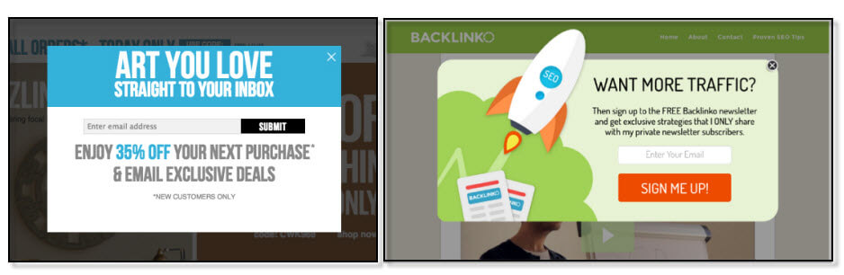
A lightbox is a box that appears on a webpage dimming the page while on it and it either has an image, a video or a text on it. A lightbox is conventionally called an overlay, which pops up on a web page typically to confirm a decision, to collect details like email IDs, or alerting the user etc. Today lightboxes are very common and almost every website uses them. Although necessary, there are certain things that should be considered before designing a lightbox.
a. More Specific
Lightboxes can be called as an extension of Call-To-Actions and that is why considering more text on the buttons is not a bad idea. Instead of simple text on the options (buttons) like ‘yes’ / ‘no’ or ‘okay’ / ‘cancel’, the text which brings more clarity would enhance the overall user experience. Example– ‘okay, book my order’ or ‘Cancel, take me back’.
b. Exit option
At times, lightboxes can be annoying and even if they are not annoying, a no exit option can make them. Although a very general exiting option of a lightbox is the ‘esc’ (escape button) on the keyboard, still a small ‘cross’ would be much better, as visuals are any day stronger.
c. Pop-up timing
The timing of the lightbox to pop-up is very important. It needs to be made sure that a lightbox doesn’t interrupt the user while he/she is going through processes like browsing the product list or making a payment. They can be useful to display the information of the features on the website (currently this is used widely on the desktop as well as mobile websites).
Chatbots
Today when the businesses are online, your store is 24 by 7 open on the internet and a potential customer visiting your store can’t go unattended. Chatbots help in acknowledging and attending these potential customers while you are away. Although it looks like a chat box, it is not, only a chat box, it is also a chatbot. A chatbot is an interactive computer programme which communicates with a user while he/she is on your website. These computer programmes are so programmed that they converse like a real human and interact to understand the requirement and provide possible solutions. Follow all above mentioned tips of you want to increase the conversion rate of your website.