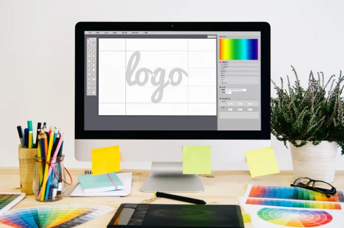
The logo is the first thing that people will see as a symbol of your brand. It will depict what your brand is and will convey the primary thought of your brand. If we talk about what is the logo design process, certain things are required to create the best logo design. people do all sorts of creative stuff to make their brand logo better, but all the efforts fail is some things are not considered. We drafted a list where we have listed 6 things to look for before finalizing your brand’s logo.
Does your audience understand your logo well?
You might have designed a beautiful logo with all sorts of colors, but it won’t make any sense if your audience doesn’t understand it or they misunderstand it as something else. The logo has to convey the real essence of your brand should be correctly perceived by the audience. For logo design, there are lots of logo design tutorials available on search engines.
Make it simple yet beautiful
Adding too many shapes and contrasting colors will make the logo cluttered. Your audience might not like a logo with a really complex design. Keep it simple with fewer colors which will also make your audience to recognize it easily when they see the logo again. Eg- Apple’s logo is simple and conveys their idea of keeping things simple and beautiful.
Don’t use too many effects
Effects like shadows, bevels, patterns may seem very attractive, but they may be a problem when viewed across various devices and formats. The logo may seem very different if you view it on your computer and you view it on a printed brochure if you use an effect. Keep this thing in mind while following logo design process.
Don’t use the colors the way you like
Color combinations denote a meaning and can’t be merely a choice of an individual. Some color combination denotes calmness and some denote energy. This theory can even be applied to shapes where a circle denotes infinity, and a spark shape denotes energy.
Make Guidelines for your Logo
If you have taken efforts and creating the logo then make sure that it should be used properly. Define the guidelines as to where should the logo be used, with which proper color combination in CMYK or RGB, what changes can be made to the logo etc. They all needed to be listed properly to maintain the uniformity and the to justify the logo’s use.
Make it usable for different formats
Designing a logo that suits different formats ranging from as big as on a hoarding to as small as on a social media page is a must. It should have that same attraction irrespective of any kind of format. These all things together can be the perfect answer for the question what makes a logo successful.
Always remember Logo is not only a symbol of your brand but also is a symbol for you, it is important to love it. It is one of the few visible elements of your business and will bring the company under a single umbrella.
Also, read- 8 Logo Design Rules That Every Brand Needs to Follow


